
Lilo
- Role
- Product Designer
- Platform
- IOS & Android
- Status
- Shipped
- Project link
- View live
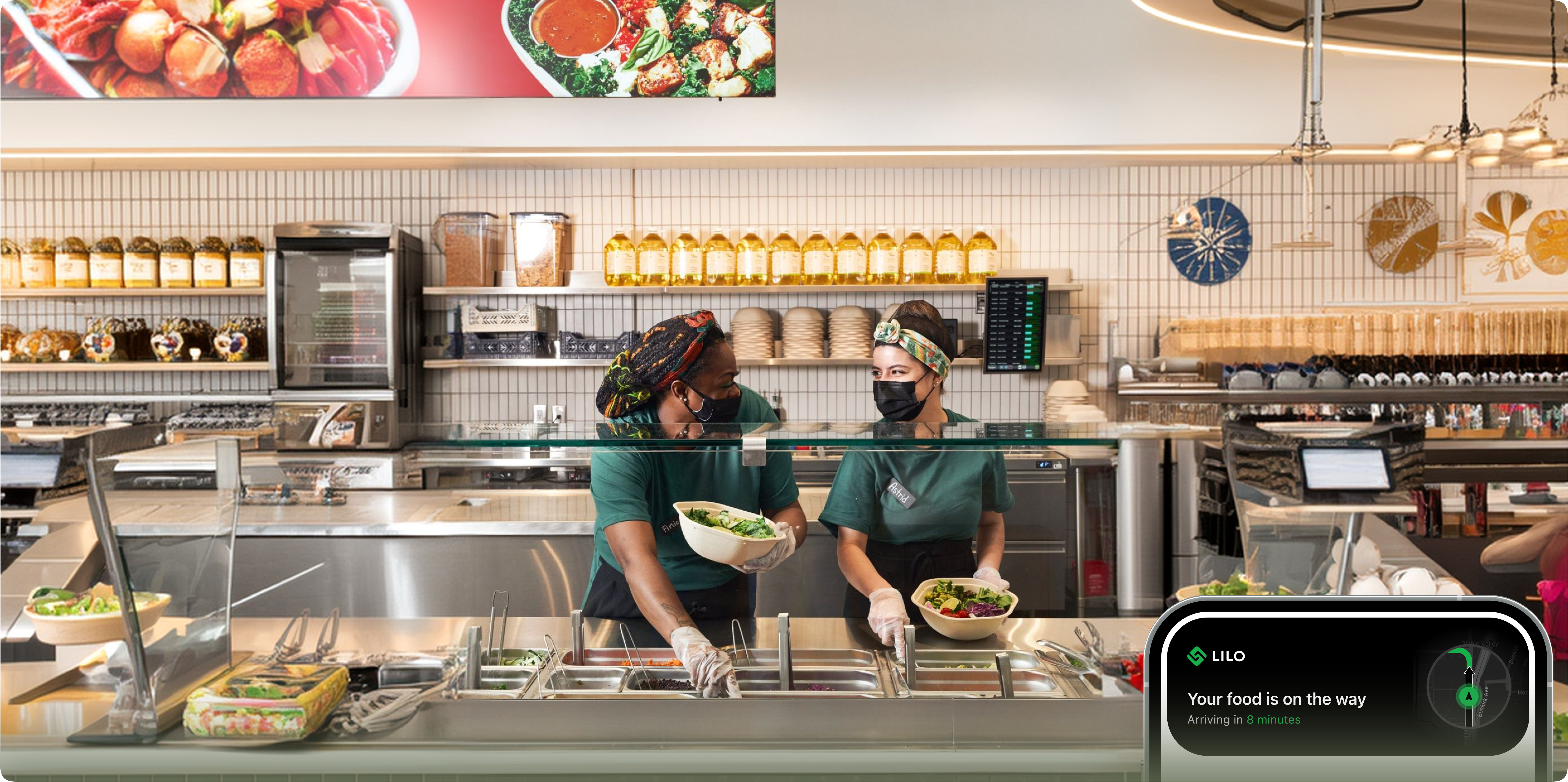
Making a smaller marketplace feel abundant instead of limited.
Lilo is a hyperlocal food delivery app connecting neighbourhood kitchens and home cooks with nearby diners, built around fast, short radius delivery.
I decided early that the product should work backward from distance and readiness, not forward from a restaurant list the radius had to shape every screen, not just the search filter.
The hard part wasn't adding anything. It was building a smaller marketplace that still felt full, without borrowing the visual language of a bigger one.
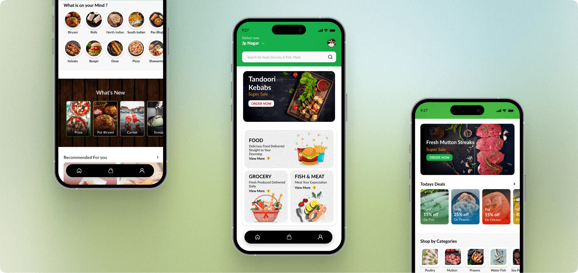
Designing against scale
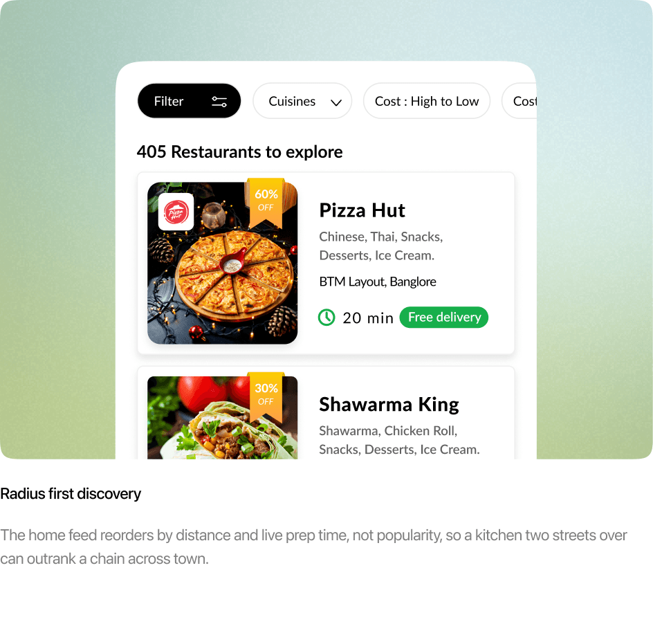
Most delivery platforms are built for chains and citywide reach, which pushes small neighborhood kitchens to the bottom of the feed.
I flipped the priority: short delivery radius first, discovery second what's close and fresh before what's simply popular.
The challenge was never adding features. It was restraint, so a smaller marketplace could still feel abundant rather than limited.
Designing for the decision
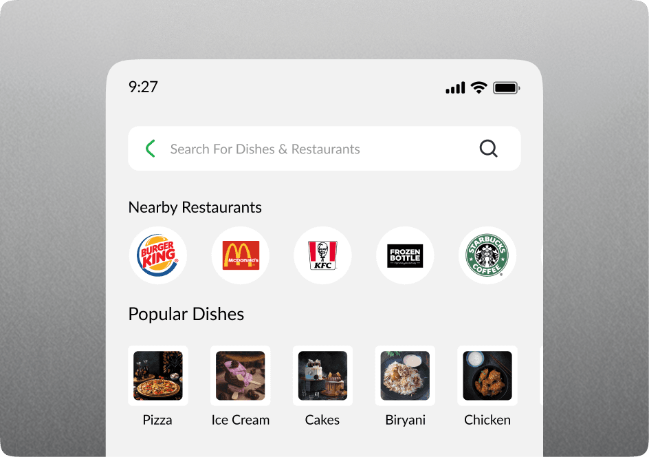
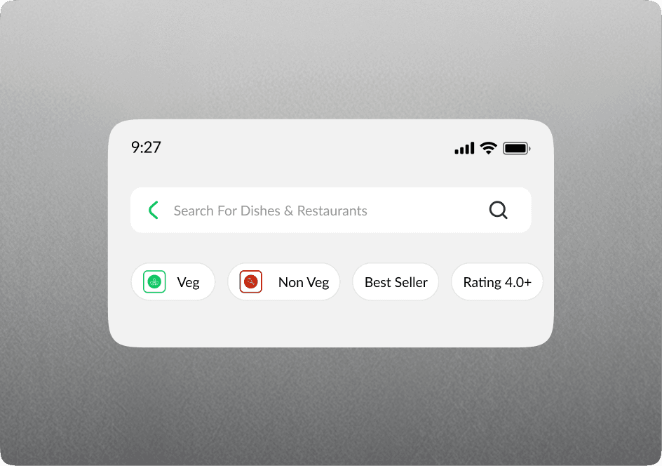
The obvious move was an endless restaurant list. I built the opposite: one question, answered first what can reach me soonest.
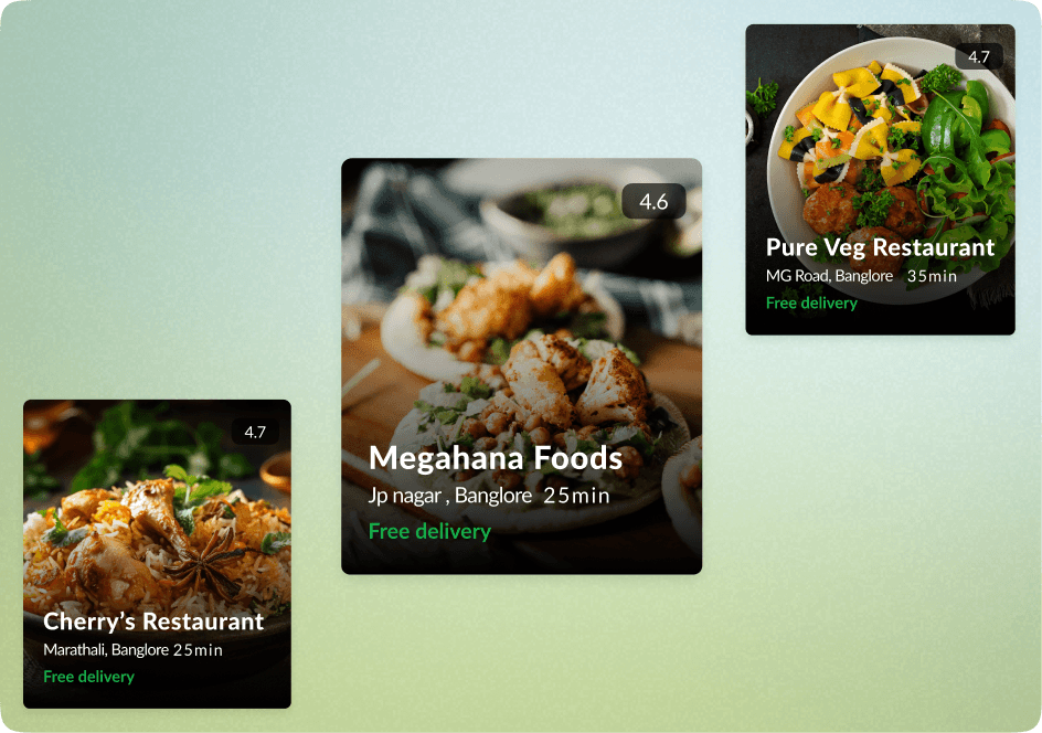
Distance and prep time surface before ratings and photos, because for a hyperlocal app ‘close’ is the differentiator, not ‘best.’
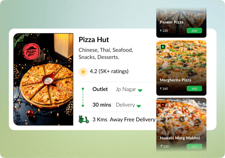
Each kitchen gets a short, human profile instead of a menu, and tracking stays honest about wider delivery windows instead of faking the precision a small kitchen can’t keep.
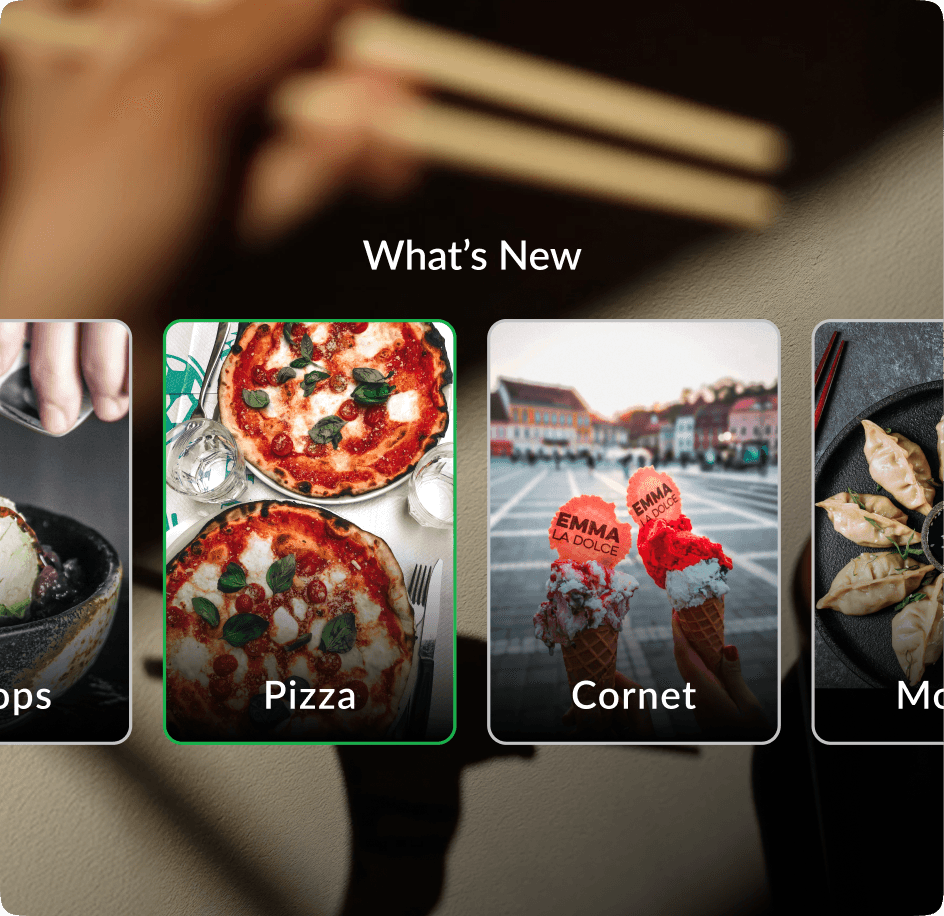
Three sides, one flow
Lilo isn’t really one app. It’s three interfaces built to move at the same speed: the diner ordering, the home cook managing what they can realistically make, and the delivery partner working a short, walkable radius instead of a citywide route.
Every decision on one side had to hold up against the other two a feature that sped up ordering but overwhelmed a home cook’s capacity, or stretched a delivery partner’s route, didn’t ship as-is.
Designing for hunger
Ghrelin, the hunger hormone, spikes right before a typical meal which means the moment someone opens Lilo is often the moment they have the least patience for friction.
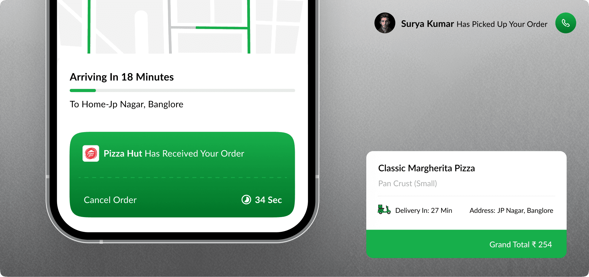
So ‘how soon’ answers before ‘how good,’ repeat orders skip discovery entirely, and once an order’s placed the only screen left is tracking.
The biology doesn’t change how the interface looks. It changes what earns a place on screen.
Smaller radius, stronger repeat
Narrowing the delivery radius didn’t shrink the product it changed who came back. Diners return to the same one or two nearby kitchens instead of browsing broadly, the opposite pattern of a typical delivery app.
Repeat orders from the same kitchen run at roughly 2.1x a citywide app’s rate, average delivery inside the launch radius sits near 18 minutes, and more than 400 home kitchens were onboarded across the first three neighbourhoods.
Learnings & Reflection
The instinct to add more filters, more categories, more reach is always available. The harder decision was choosing what to leave out, so ‘hyperlocal’ stayed true instead of becoming a marketing word for just another delivery app.